What Makes a Good Storefront Sign? 8 Design Principles to Follow
By Global Signs & Graphics 24-08-2026 78
A storefront sign is often the first interaction a potential customer has with a business. Before someone enters a store, restaurant, salon, office, or retail space, the sign helps communicate what the business is, what it offers, and what customers can expect. In a competitive market like Los Angeles, effective storefront signage can make a meaningful difference in attracting attention and building brand recognition.
However, a good storefront sign is about more than simply displaying a business name. It needs to be readable, appropriately sized, visually appealing, durable, and compatible with the surrounding building and streetscape. Here are eight important design principles to consider when creating custom storefront signs in Los Angeles.
1. Prioritize Readability
The primary purpose of a storefront sign is communication. If customers cannot quickly read it, even an attractive design can fail.
Choose fonts that are easy to recognize from the intended viewing distance. Avoid overly decorative typefaces, excessive text, and cramped layouts. Strong contrast between the lettering and background can also improve visibility.
Think about how the sign will appear to pedestrians, drivers, and customers approaching from different directions. A sign that looks excellent up close may not work effectively from across a busy street.
2. Keep the Design Simple
Effective storefront signage rarely requires a complicated design. A clear business name, recognizable logo, and limited supporting information are often enough.
Too many words, colors, graphics, or design elements can make a sign difficult to understand. A simple design allows customers to identify the business quickly, particularly in busy commercial areas.
For businesses in Los Angeles, where storefronts may compete with surrounding businesses, traffic, buildings, and other visual elements, simplicity can help a sign stand out without becoming overwhelming.
3. Choose the Right Size and Scale
A storefront sign should be proportional to the building and its façade. A sign that is too small can disappear visually, while one that is too large may overwhelm the architecture.
Los Angeles planning guidance emphasizes appropriate scale and visibility, including considering whether signage is primarily viewed by pedestrians or motorists.
Before fabrication, evaluate the storefront from the actual viewing distance. Consider sidewalk width, traffic patterns, building height, neighboring signs, and the location of entrances and windows.
4. Use Colors Strategically
Color is one of the fastest ways to communicate brand identity. Your storefront sign should use colors that complement your existing logo, building façade, and overall brand.
High contrast is particularly important for readability. For example, light lettering against a dark background can create strong visual separation, while similar shades may become difficult to distinguish.
Avoid using too many colors simply to make a sign more noticeable. A controlled color palette generally produces a more professional appearance.
5. Select Durable Materials
Storefront signs are exposed to sunlight, rain, dust, temperature changes, and everyday environmental conditions. Choosing durable materials can help protect the appearance and performance of the sign.
Depending on the application, businesses may consider materials such as aluminum, acrylic, PVC, dimensional lettering, or metal. The appropriate choice depends on the design, location, budget, and desired lifespan.
Quality installation is equally important. A well-designed sign still needs proper mounting and finishing to remain secure and attractive over time.
6. Consider Illumination
If your business operates after sunset, illuminated storefront signage can improve visibility and brand presence.
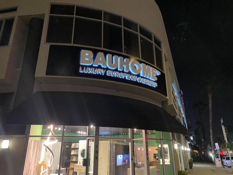
Options can include internally illuminated channel letters, backlit dimensional letters, lightboxes, or other LED-based solutions. Illumination should make the sign easier to see without creating excessive glare.
Los Angeles sign regulations include specific requirements concerning sign illumination. Under the city's current general sign rules, illumination cannot produce light intensity greater than 3.0 footcandles above ambient lighting at the property line. Applicable requirements can vary by property and zoning context.
7. Match the Building and Neighborhood
A storefront sign should attract attention while still fitting its environment. Consider the architecture, façade materials, neighboring businesses, and overall character of the area.
Los Angeles planning guidance recommends signage that is compatible with the height, size, shape, location, and colors of the structure. It also emphasizes coordinated signage where multiple storefronts share a building.
This is especially important for businesses operating in shopping centers, historic buildings, mixed-use developments, and established commercial districts.
8. Check Local Sign Regulations Before Installation
An attractive design is not enough if the sign does not meet local requirements. Before fabrication or installation, business owners should verify applicable zoning, sign area, placement, height, illumination, permitting, and district-specific requirements.
Los Angeles currently has both the original Zoning Code and the new Chapter 1A code operating in different areas as the citywide rezoning process continues.
Working with an experienced Los Angeles sign company can help businesses identify potential permitting and design considerations before production begins.
Build a Storefront Sign That Works for Your Business
A successful storefront sign combines design, visibility, branding, durability, and compliance. The best storefront signs do more than identify a location—they help establish a business's visual identity and make it easier for customers to recognize and remember the brand.
Whether you need dimensional letters, illuminated channel letters, acrylic signage, or another type of custom storefront signage in Los Angeles, start by considering how customers will see the sign, what message they need to understand, and how the sign will work with the building around it.
When these eight principles are addressed from the beginning, your storefront sign can become a long-term investment in your business's visibility and professional image.
FAQs About Storefront Signs
What type of storefront sign is best for a business?
The best option depends on the business, building, viewing distance, branding, budget, and local regulations. Channel letters, dimensional letters, cabinet signs, and flat-panel signs are common choices.
How large should a storefront sign be?
There is no universal ideal size. The sign should be large enough to remain readable from its primary viewing distance while remaining proportional to the storefront and compliant with applicable regulations.
Are permits required for storefront signs in Los Angeles?
Depending on the sign type, location, property, and applicable zoning regulations, permits or approvals may be required. Businesses should verify requirements before installation.
How can I make my storefront sign more visible at night?
LED illumination, channel letters, backlit lettering, and other illuminated sign solutions can improve nighttime visibility while supporting a professional appearance.
Why choose custom storefront signage?
Custom signage allows a business to match its logo, brand colors, building architecture, dimensions, and customer viewing conditions rather than relying on a generic sign design.