I've reviewed dozens of digital products over the years: SaaS dashboards, ecommerce stores, mobile apps. And one thing keeps surprising me. Most of the time, it's not the big, obvious stuff that's hurting performance. It's the small UX mistakes that nobody noticed, because everyone on the team got too close to the product.
Users don't send you a complaint email when they're confused. They just leave. And that quiet exit is costing businesses real money every single day.
In this guide, I'm going to walk you through the most common UX mistakes I see repeatedly, and give you a working UI UX audit checklist you can use to catch these problems before they catch you.
Why UX Mistakes Are Harder to Spot Than You Think
Here's the uncomfortable truth: most UX problems aren't dramatic. You won't see a broken button or a crashed page. What you'll see is a checkout flow with one extra, unnecessary step that drops conversions by 15%. A navigation label that makes perfect sense to your development team but confuses first-time visitors. A mobile layout that technically works but frustrates users into bouncing.
The reason these mistakes survive is simple: they look fine internally. Your team uses the product every day and has mentally filled in all the gaps. A fresh user hasn't.
This is exactly why a structured UI UX audit checklist matters. It forces you to look at your product the way a stranger would.
The Most Common UX Mistakes (That People Keep Making)
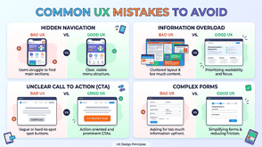
1. Unclear Visual Hierarchy
When everything on a page looks equally important, nothing stands out. I see this constantly: bold headings, bold subheadings, bold body copy, all competing for the same level of attention. Users scan before they read, and if your hierarchy doesn't guide that scan, they give up.
The fix: Use size, weight, spacing, and contrast deliberately. Your primary CTA should visually dominate the page. Supporting text should support, not compete.
2. Overloaded Navigation
More links in your nav does not mean better discoverability. It means more cognitive load. When users face 10 navigation options, they often pick none of them.
I worked with a B2B SaaS company that had 11 items in their top navigation. After trimming it to 5 clear categories, time-on-site went up and support tickets about "where to find X" dropped significantly.
The fix: Audit what users actually click. Everything else either consolidates under a cleaner parent category or gets dropped entirely.
3. Forms That Ask for Too Much Too Soon
Asking for a phone number, company size, job title, and annual revenue before someone has even seen your product is a relationship killer. Forms are a commitment, and the bigger the commitment you ask for upfront, the more people walk away.
The fix: Progressive disclosure works wonders here. Collect only what you need at each stage. Ask for more as trust builds.
4. Ignoring Mobile Context
Designing mobile as a shrunken version of desktop is one of the most persistent UX mistakes I encounter. Mobile users are often in a different physical context: on the move, one-handed, distracted. They need faster access to core actions, not a compressed version of a full dashboard.
The fix: Design mobile-first, or at minimum, test your mobile experience as a separate workflow with realistic user scenarios.
5. Missing or Vague Error Messages
"Something went wrong" is not helpful. Neither is a red border around a form field with no explanation. Error messages are a moment of vulnerability for the user. They've done something unexpected and they need clear guidance.
The fix: Write error messages that explain what happened and what to do next. "Password must be at least 8 characters" beats "Invalid password" every single time.
6. Poor Loading Feedback
Users can tolerate waiting. What they can't tolerate is not knowing if anything is happening. If your app takes 3 seconds to process something and shows no indicator, users will click the button again, assume it's broken, or abandon entirely.
The fix: Use loading states, skeleton screens, or progress indicators for any action that takes longer than about 1 second.
7. Inconsistent UI Patterns
When your primary button looks different on page 3 than it does on page 1, users have to re-learn your interface. Inconsistency creates friction, and friction kills trust.
The fix: Build or follow a design system. If you don't have one, create a simple component reference doc that everyone on the team uses.
Your Practical UI UX Audit Checklist
Run through this checklist when evaluating an existing product or reviewing designs before launch. It won't replace full usability testing, but it will catch the most common problems fast.
Navigation & Information Architecture
- [ ] Can a first-time user understand the main navigation within 5 seconds?
- [ ] Are navigation labels written in plain language (not internal jargon)?
- [ ] Is the current page or section clearly indicated?
- [ ] Is the search function easy to find and does it return relevant results?
Visual Design & Hierarchy
- [ ] Is there a clear visual hierarchy on every key page?
- [ ] Does the primary CTA visually stand out from secondary actions?
- [ ] Is the colour contrast ratio accessible (minimum 4.5:1 for body text)?
- [ ] Are fonts legible at all sizes, including on mobile?
Forms & Inputs
- [ ] Are form fields labelled clearly (not just placeholder text)?
- [ ] Does the form ask only for essential information?
- [ ] Are error messages specific and actionable?
- [ ] Does the form remember user input if a validation error occurs?
Mobile Experience
- [ ] Are all tap targets at least 44x44 pixels?
- [ ] Can the core user journey be completed one-handed on mobile?
- [ ] Is the layout tested on both small (iPhone SE) and large (iPhone Pro Max) screens?
- [ ] Does the page load in under 3 seconds on a mid-range mobile connection?
Feedback & System Status
- [ ] Do buttons and links show hover/active states?
- [ ] Are loading states shown for any action taking longer than 1 second?
- [ ] Are success and error confirmations clearly visible after form submissions?
Consistency
- [ ] Are UI components (buttons, inputs, cards) visually consistent across the product?
- [ ] Is the tone of copy consistent throughout?
- [ ] Do similar actions always trigger similar outcomes?
Accessibility Basics
- [ ] Can the interface be navigated by keyboard alone?
- [ ] Do images have descriptive alt text?
- [ ] Are interactive elements identifiable without relying on colour alone?
How to Use the Audit Effectively
Running through this checklist solo is useful. Running it with someone who's never used your product is far more useful.
I'd recommend doing the following:
First, do a heuristic walkthrough yourself using the checklist above. Screenshot every issue you flag.
Then, recruit 3–5 users who match your target audience and watch them complete 2–3 key tasks without assistance. Don't guide them. Just observe where they hesitate, backtrack, or give up.
Finally, combine what you found in both exercises and prioritise fixes by impact. A broken mobile checkout flow takes priority over slightly inconsistent icon sizing, even if the icon issue was easier to spot.
When to Do a Full UX Audit vs an Ongoing Review
A full UI UX audit makes sense at a few key moments: before a major redesign, after a significant drop in conversion or engagement metrics, or when you're preparing a product for a new market or user segment.
Ongoing reviews, using analytics, session recordings, and regular usability testing, should be part of your normal product cycle regardless. The checklist above works well as a lightweight monthly review to catch drift before it compounds.
Final Thoughts
Most UX mistakes don't announce themselves. They hide inside interactions that technically work but feel subtly wrong to users. The cumulative effect of those moments, a confusing label here and an unexplained error there, is what separates products people love from products people tolerate.
The UI UX audit checklist in this guide is a starting point, not a complete solution. The goal is to build a habit of looking at your product with fresh eyes, asking the uncomfortable questions, and following what the data and real users actually tell you.
If you're ready to go deeper, explore our related guide on running a full usability test from scratch, or look into heuristic evaluation frameworks like Nielsen's 10 usability heuristics as a complementary method to the checklist above.
Tags : Technology