UX Design Trends in 2026 That Are Actually Changing How People Use Products
By Tasnia Rahman 05-06-2026 58
I've been reviewing digital products professionally for a while now, and I'll be honest the gap between teams that keep up with UX design trends and those that don't has never been more visible. Users aren't just comparing your product to your competitors anymore. They're comparing it to every well-designed app they used that morning. That's a high bar.
If you're a designer, product manager, or founder trying to figure out where to focus your energy this year, this article walks you through the trends that are genuinely moving the needle and gives you a UI UX audit checklist you can actually use to evaluate where your product stands today.
Why UX Design Trends Matter More Than Ever in 2026
There's a version of this conversation where I tell you trends are just noise and you should focus on timeless principles. That's partly true. But ignoring where the industry is moving is how products quietly fall behind without anyone noticing until the churn numbers show up.
The reason these trends matter right now is that user expectations are shifting faster than most product cycles. What felt premium two years ago can feel dated today not because the design is broken, but because the context around it changed.
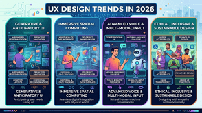
That said, not every trend deserves your attention. What I'm covering here are patterns showing up consistently across well-performing products, backed by real user behaviour shifts not design-Twitter aesthetics.
The UX Design Trends Actually Worth Your Attention
1. Adaptive Interfaces Based on User Behaviour
The most interesting shift I've seen lately is products that genuinely change how they present information depending on what a specific user actually does not just which device they're on.
This isn't personalisation in the old marketing sense. It's interface logic that notices you always skip the onboarding prompts and stops showing them. It notices you use keyboard shortcuts and surfaces more of them. It's subtle, but it dramatically reduces friction for returning users.
If you've been treating all users as first-time users in your interface, that's worth revisiting.
2. Accessibility as a Design-First Decision, Not a Checklist
Here's a shift that's been building for years and has fully arrived: teams that treat accessibility as a compliance exercise are producing worse products. Teams that treat it as a design constraint from day one are producing better ones for everyone.
High contrast modes, keyboard navigation, scalable type, and focus states aren't just for users with disabilities. They improve usability across low-light conditions, older devices, fast scanning behaviour, and stress-based usage contexts. The data on this is pretty clear at this point.
If your current design process adds accessibility review at the end, that's a structural problem worth fixing.
3. Micro-Interactions That Confirm Rather Than Decorate
There was a phase where micro-interactions were mostly about making things feel delightful. That's not quite where the best products are landing now. The trend is toward micro-interactions that confirm intent animations and feedback that tell you "yes, that worked" or "wait, are you sure?" in a fraction of a second.
The functional ones are reducing errors, not just adding polish. Think of the difference between a button that animates when clicked versus one that visually confirms your form submission actually went through. The second one is doing real UX work.
4. Reduced Cognitive Load Through Progressive Disclosure
This one sounds like jargon, but it's straightforward in practice: don't show users everything at once. Show them what they need at each step, and let them pull more detail when they're ready.
This is showing up in onboarding flows, settings panels, complex dashboards, and checkout experiences. The products doing it well have noticed that users don't abandon because they can't find features they abandon because they feel overwhelmed before they even try.
5. Voice and Conversational Interfaces Alongside Visual UI
Voice-first isn't replacing visual interfaces. But hybrid products ones where you can either tap through a flow or just ask are becoming a real differentiator in certain categories. Healthcare tools, productivity apps, and customer support flows are seeing meaningful adoption here.
The UX challenge is designing for both paths without either feeling like an afterthought. That's a harder design problem than it sounds.
A Practical UI UX Audit Checklist for 2026
Reading about trends is useful. Knowing where your own product actually stands is more useful. Here's a working UI UX audit checklist I use when reviewing products not exhaustive, but focused on the areas most likely to reveal real problems.
Navigation and Information Architecture
- Can a new user reach their core goal within three interactions?
- Is the primary navigation consistent across all screen sizes?
- Are there more than two levels of nested navigation anywhere in the product?
- Do breadcrumbs or back navigation work predictably throughout?
Visual Hierarchy and Readability
- Is there a clear primary action on every key screen?
- Is body text at least 16px on desktop and 14px on mobile?
- Are interactive elements visually distinguishable from static content?
- Does the layout hold together at 150% browser zoom?
Accessibility
- Do all images have meaningful alt text?
- Can the entire core user journey be completed using only a keyboard?
- Does colour alone ever carry critical information (it shouldn't)?
- Is the contrast ratio at least 4.5:1 for all body text?
Performance Perception
- Do users see meaningful content within two seconds on a standard connection?
- Are loading states shown immediately when an action is triggered?
- Does the interface remain responsive during data fetching?
Error Handling and Trust
- Are error messages written in plain language, not technical codes?
- Does each error message explain what to do next?
- Is there visual confirmation after every irreversible action?
Mobile and Touch Usability
- Are all tap targets at least 44x44 pixels?
- Are forms functional on mobile without horizontal scrolling?
- Is the product usable with one hand on a standard phone screen?
Going through this checklist honestly on your own product usually surfaces two or three issues worth addressing before you touch anything trend-related.
How to Prioritise What You Actually Fix First
One mistake I see often is teams running a UX audit, finding ten problems, and then either trying to fix everything at once or getting stuck deciding where to start.
My actual recommendation: sort issues by the combination of frequency (how many users hit this?) and severity (what does it cost them when they do?). High frequency and high severity issues first those are the ones where fixing them moves real metrics. Lower-severity aesthetic improvements can wait.
If you're working against trends specifically, start with cognitive load and accessibility. They have the widest impact, they're defensible decisions internally, and they compound over time as your product scales.
Putting It Together
UX design trends in 2026 aren't asking you to redesign everything. The most impactful ones adaptive interfaces, genuine accessibility, functional micro-interactions, progressive disclosure are refinements to things most products already have in some form.
The UI UX audit checklist above is a starting point, not a final word. Use it to identify your highest-impact gaps, prioritise ruthlessly, and test your changes with real users before you declare them done.
If you want to go deeper on any of these areas, a dedicated guide on accessibility auditing or a walkthrough of information architecture reviews would be a good next step. Start with the audit. Everything else gets easier once you know what you're actually working with.
Tags : Technology