Mobile Optimized Ecommerce Website: Why It's the Difference Between a Sale and a Bounce
By Mitu Das 17-06-2026 2
You've probably done this yourself without even thinking about it. You tap a product link from Instagram or a Google search, the page loads slowly, and you end up pinching the screen just to read the price. A few seconds later, you're gone. No purchase, no email signup, nothing. Multiply that moment across thousands of visitors and you start to understand why some stores get decent traffic but still struggle to convert it into sales.
This isn't a hypothetical. I've reviewed stores that were paying for ads and getting real clicks, only to lose most of that traffic the moment someone opened the site on a phone. The product was good. The price was fair. The website just wasn't built for how people actually shop today.
In this guide, I'll walk through what a mobile optimized ecommerce website actually needs to do, the small mistakes that quietly cost sales, and how to fix or rebuild your store without needing an enterprise-sized budget.
What "Mobile Optimized" Actually Means
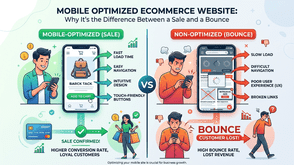
A lot of business owners assume their site is mobile optimized simply because it doesn't look broken on a phone. That's mobile-friendly, not mobile-optimized, and the difference matters more than it sounds.
A mobile-friendly site avoids obvious problems, like text running off the edge of the screen. A mobile optimized ecommerce website goes further: every layout, button, image, and checkout step is designed for someone using one thumb, on a smaller screen, often on a slower connection, frequently while distracted or in a hurry.
In plain terms, mobile optimization means your store loads quickly, buttons are easy to tap without zooming, product images are clear without slowing the page down, and customers can move from browsing to checkout without fighting the interface. If any of those break down, you're losing sales you'll never see reported anywhere except as an unexplained bounce.
Why It Affects Your Sales, Not Just Your Search Ranking
It's easy to treat mobile optimization as purely an SEO checkbox, something Google rewards. That's part of it, since Google has used mobile-first indexing for years now, meaning it largely evaluates the mobile version of your site to decide how it ranks. But ranking is only half the story.
The bigger issue is simpler: most online shopping traffic today comes from phones, often well over half depending on the industry. If checkout is clunky on mobile, you're not just risking a lower position in search results, you're losing money on traffic you already paid for or earned.
I've seen this play out with a small clothing retailer who had strong product photography and a loyal social following. Their ads converted reasonably well until customers landed on a site that was clearly built for desktop first, requiring pinch-zooming just to read sizing and shipping details. Rebuilding the mobile layout alone increased completed checkouts noticeably within weeks, with no change to ad spend or pricing.
The Core Features Every Mobile Optimized Ecommerce Website Needs
Whether you're rebuilding from scratch or improving an existing store, a handful of elements matter more than the rest:
- Fast loading speed: Compressed images, minimal pop-ups, and clean code so pages load in a couple of seconds rather than five or six.
- Thumb-friendly navigation: Menus, filters, and buttons sized and spaced for tapping with one hand, not a mouse cursor.
- Simplified checkout: Fewer form fields, autofill support, and a guest checkout option so people aren't forced to create an account just to buy something.
- Readable typography without zooming: Text and prices large enough to read instantly, especially on product and pricing pages.
- Mobile-friendly payment options: Apple Pay, Google Pay, or similar one-tap methods reduce the friction of typing card numbers on a small keyboard.
None of this requires flashy design. It requires discipline about removing friction at every single step of the buying process.
Common Mistakes That Quietly Kill Mobile Sales
A few patterns show up again and again when reviewing underperforming stores. Intrusive pop-ups that cover the entire screen the moment someone lands on a page are one of the worst offenders, partly because Google's own guidance flags these as a poor mobile experience, and partly because they frustrate real buyers before they've seen anything worth buying.
Other recurring issues include image-heavy pages that take too long to load on mobile data, tap targets placed so close together that customers hit the wrong button, and checkout forms clearly designed for a desktop screen and simply shrunk down rather than rebuilt for a smaller one.
If your store shows a high mobile bounce rate alongside decent desktop conversions, these are usually the first places worth checking.
Building a Mobile Optimized Store Without Blowing Your Budget
This is where many small business owners get stuck. They know the site needs work, but assume fixing it means a five-figure invoice. That's not usually true.
Affordable ecommerce website development today often starts with a platform like Shopify or WooCommerce paired with a mobile-first theme, rather than building everything from scratch. Most modern themes are already responsive out of the box, so the real cost goes into customizing checkout flow, page speed, and product layout, not reinventing the basic structure.
A practical approach is to audit first, then fix in order of impact. Start with checkout and page speed, since those affect every single visitor. Then improve navigation and product pages. A full custom redesign can come later, once you actually know which parts of your current site are losing sales rather than guessing. (If you're trying to estimate what a rebuild might realistically cost for a store your size, a detailed ecommerce pricing guide is worth reading before requesting quotes from developers.)
How to Check If Your Store Is Actually Mobile Optimized
You don't need to guess. Google's PageSpeed Insights tool shows load times and specific mobile usability issues for free, and the mobile usability report inside Search Console flags pages with tap targets placed too close together or text that's too small to read comfortably.
Beyond the technical tools, the simplest test is also the most honest one: open your own store on your phone, using mobile data rather than wifi, and try to actually buy something. Notice where you hesitate, zoom in, or get frustrated. Those friction points are exactly what real customers are running into right now.
The Bottom Line
A mobile optimized ecommerce website isn't a nice-to-have anymore. It's the baseline most customers expect before they'll trust you with their card details. The encouraging part is that fixing mobile issues is usually more about removing friction than adding new features, and it doesn't require an unrealistic budget to get right.
If you're not sure where your store currently stands, start with a simple mobile audit of your own checkout process this week. And if you'd like a second opinion on what an affordable rebuild or targeted fix would realistically cost for your specific store, reaching out to a developer for a straightforward quote is a reasonable next step, with no obligation attached.
Tags : Technology