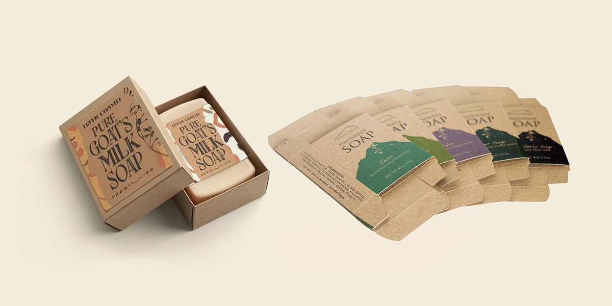
Minimalist and bold custom soap box designs can both work well, but the best choice depends on your brand and customers. Minimalist packaging gives soaps a clean, simple, and premium look, while bold designs use bright colors and strong visuals to grab attention.
For natural and luxury soaps, a minimalist design often works better. A bold, colorful box tends to do better on a gift shelf or seasonal display, where it has to catch someone's eye first. Let’s look at both styles and find out which one is right for your soap brand.
Your soap packaging creates the first impression of your product. That’s why choosing between a minimalist and bold design is important. In this blog, we’ll compare both styles, discuss their benefits, and help you choose the right custom soap packaging design for your brand.
Minimalist Soap Box Design Is All About Keeping Things Simple
Before comparing the two styles, let's learn what "minimalist" actually means on a soap box.
A minimalist soap box keeps things simple on purpose. It usually sticks to one or two neutral colors, a plain typeface, and a small logo instead of a big design covering the box. There's just a clean surface, often Kraft or matte finish, that lets the material itself do the talking.
A few things to look for:
- One or two neutral colors (white, kraft, sage, black)
- Small, centered logo, not a full-panel design
- Plain, matte, or Kraft finish instead of heavy print
This style is common in natural and organic soap brands, where a simple box matches a simple, short ingredient list.
On the Other End: What Does a Bold Soap Box Design Actually Look Like?
“If minimalist packaging keeps things simple, bold packaging is made to stand out.”
A bold box uses bright colors, large text, and eye-catching graphics to grab attention.
These boxes are a good choice for products displayed on busy shelves. They can include colorful patterns, illustrations, or designs that match the soap’s scent and style, helping customers notice the product quickly.
Common features include:
- Strong colors or high contrast → e.g., deep purple with gold accents for a lavender line
- Illustration or pattern tied to the product → e.g., citrus fruit graphics on a lemon-scent bar
- Foil, embossing, or gloss finish → e.g. gold foil lettering on a holiday gift box
This style is mostly used for gift sets, seasonal soaps, and spa lines. When soap is given as a gift, the box becomes part of the gift too.
What’s the Difference Between Minimalist vs. Bold Soap Boxes?
There's no single winner here; it depends on where the soap is sold. Minimalist and bold don't perform the same way in every setting. Each one is built for a different kind of shelf.
Minimalist Wins on a Quiet Shelf
Minimalist fits right in on a boutique or spa shelf, where the buyer already knows what they came for.
Bold Wins on a Busy Shelf
Bold has to grab attention fast, useful in a crowded retail aisle or seasonal gift display.
Low-Cost vs. High-Cost Print
- Minimalist keeps print costs down → fewer colors, simpler finish.
- Bold costs more → extra colors, foiling, and coatings add up fast.
One-Time Buy vs. Repeat Buy
- Everyday soap → design should be easy to recognize when the buyer comes back.
- Gift soap → design should stand out the first and only time it's seen.
Does the Buyer Matter More Than the Shelf When Choosing a Soap Box Design?
The shelf tells you where a design works best. But the buyer tells you why it works, because different people are looking for different things when they pick up a soap.
The Buyer Who Reads Labels
Some buyers care about what's inside the soap before anything else. They check the ingredients, look for natural or simple formulas, and trust a clean, plain box more than a flashy one. For this buyer, a minimalist design feels honest
Example: A plain Kraft box with the ingredient list printed right on the front.
The Buyer Who's Shopping for a Gift
This buyer doesn't stop to read labels. They're picking something that looks nice, feels special, and will make a good impression when it's given to someone else. They decide in seconds, based purely on how the box looks. A bold, colorful box with foil or shiny finishing catches their eye fast
Example: a festive gift set with gold foil lettering, sitting on a holiday display, is exactly the kind of thing this buyer stops for.
The Buyer Who Orders in Bulk (Wholesale)
This buyer has already made up their mind. They're not deciding whether to try the soap; they're placing a repeat order, often in large quantities. For them, design matters less than getting the same box, made the same way, every single time. What they care about is consistency and reliable production, not how eye-catching the box looks.
Example: A wholesale bakery-style soap seller might reorder the exact same simple Kraft box every month without changing a thing.
Does the Material You Pick Affect Minimalist or Bold Design?
The material decides how far the design can actually go, often before a single color is even chosen. A bold concept on the wrong surface just won't print the way it was imagined.
Kraft soap boxes push toward minimalism.
Kraft soap boxes naturally lean toward a minimalist look, not because they can’t support bold printing, but because the brown, uncoated surface can make printed colors appear softer and less vibrant. Coated cardstock, on the other hand, provides a smoother surface that can make colors look brighter and more vivid, making it a strong choice for bold packaging designs.
Coated cardstock supports bold design much better.
It takes bright inks, foil, and gloss finishes without the print turning muddy, which is why most gift-style and seasonal soap boxes are built on it rather than plain Kraft.
Soap boxes with a window work with either style.
But the window's size shapes the outcome. Keep it small, and the box still reads as minimalist. Make it large, and the window itself becomes a design feature , sometimes the boldest part of the whole box.
A good design isn't enough. It also has to print well. So it's smart to talk to a packaging provider before you print. Many providers do this; for example, BoxLark helps brands pick the right material and design together before printing starts. Why? Because a design can look perfect on a screen. But once it's printed on Kraft or on coated paper, it can look different. Getting this step right early saves both time and money later.
Conclusion
There's no single design that wins every time. A minimalist box works when the buyer already trusts the product and wants an honest, simple look. A bold box works when the box itself has to do the selling, fast, before the buyer thinks it over.
“The best soap box isn't the boldest or the quietest one — it's the one that fits the buyer standing in front of it.”
This guide should make one thing easier: instead of guessing between styles, you now know exactly what to check , where the soap is sold, who's buying it, and what the material allows. Answer those three, and the right design becomes obvious on its own.
Tags : .....