Design quality and user perception often decide whether someone trusts your brand within secchooses a competitor. You need clear visuals that signal care, confidence, or risk losing buyers before the copy is read.
If your design feels careless, people assume the same about your brand. That reaction happens fast, and it shapes buying intent from the start.
As a marketing professional, you know how first impressions influence brand value. Design choices guide how people judge usability, reliability, and credibility without conscious effort.
If you want to capture attention as fast as possible, keep reading this quick guide.
Why Is Design Quality and User Perception Important?
In branding, design quality, and user perception matter because people judge your brand on first impression. It influences trust, interest, and intent through visuals that signal care, clarity, and confidence.
The moment your brand design feels intentional, buyers assume the same about your product and your team. It also makes digital marketing much easier to navigate.
Some key benefits include the following:
- Faster trust during first contact: When someone lands on your page, you have seconds to shape their opinion. Clean visuals and clear structure help you look prepared and reliable right away.
- Clear brand recognition across channels: Consistent design helps people recognize you wherever they see your brand. You create familiarity across ads, pages, and products without repeating explanations.
- Better message clarity with less effort: Strong design guides attention so people grasp your message quickly. You let visuals carry structure while copy delivers meaning.
- Stronger confidence in product value: Well-executed design signals care and intention. You show that details matter, which directly reflects how you approach your product.
- Reduced hesitation during decision making: Clear and familiar visuals remove uncertainty during key moments. You help users move forward without stopping to question what they see.
- Stronger emotional connection with your brand: Visual consistency creates a sense of comfort for buyers. You make interactions feel familiar and intentional across touchpoints, which encourages repeat visits.
- Higher perceived professionalism and reliability: Polished design signals that you take your work seriously. You set expectations for quality before users try the product, strengthening trust at every stage of engagement.
How to Leverage Design Quality and User Perception
To grow your business through design quality and user perception, here are the tips you can try out.
1. Keep Layouts Clean And Easy To Scan
The first thing you need to do is remove visual noise so people can process information fast. You guide the eye with spacing, clear headings, and simple structure instead of crowding every area.
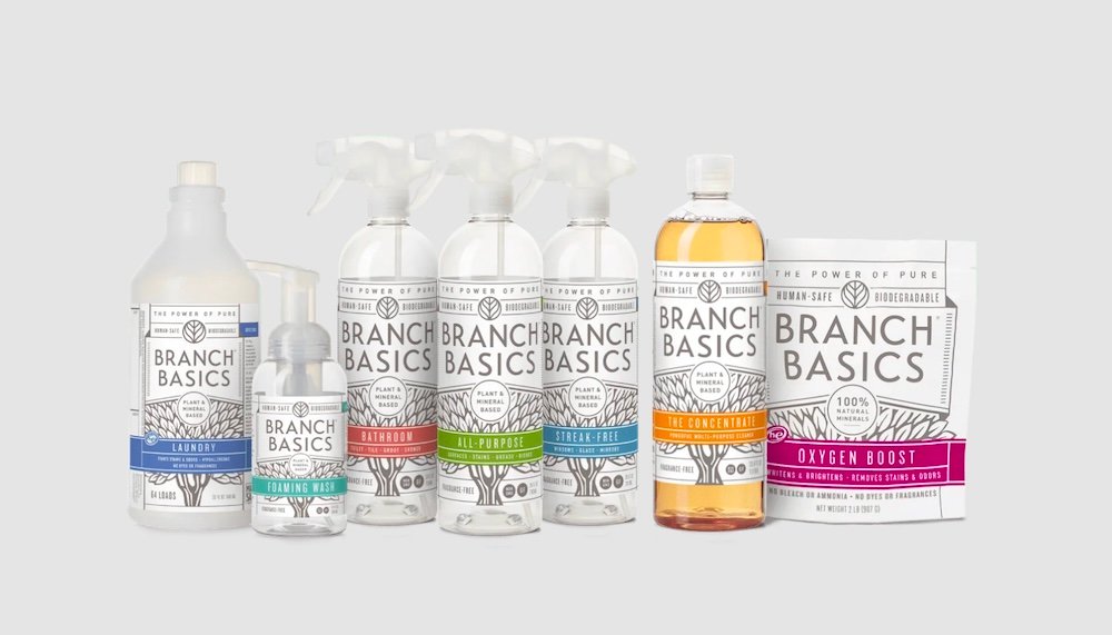
One thing you should never do when building your banner design is try to force too much information into one area, like in the example below.

Image via Branch Basic
Keeping layouts clean ensures your buyers grasp value without effort. They see what matters first, what comes next, and where to act. That clarity builds confidence and reduces hesitation before they form opinions about your brand.
2. Prioritize Readability In Every Interface
The moment text feels hard to read, attention fades. Prioritizing readability involves choosing clear fonts, ensuring proper contrast, and spacing that allows words to breathe.
This makes content easy to absorb at a glance, which directly shapes design quality and user perception. You can see how the key branding takes center stage in the example below: notice how you can still read everything else clearly?
Good design readability reduces strain on the eyes and removes friction that causes users to abandon a page. You ensure headlines land, details stay clear, and calls to action feel natural.
3. Show Care Through Small Visual Details
Another key design quality and user perception tip is displaying small visual details that provide more brand information. You refine spacing, alignment, icon clarity, and subtle interactions that people may not name but always feel.
This is a good way to show users that the design wasn’t rushed.
Simple things like clean edges, smooth transitions, and consistent visual cues help reduce doubt and create a sense of comfort. You guide people to see your brand as dependable and well considered.
4. Maintain Consistency Across All Touchpoints
Consistent patterns sometimes have a more lasting impact than the message you’re trying to push across. It’s important to craft a unified experience that feels intentional and professional at every stage.
You need to present the same visual cues, tone, and structure wherever users meet your brand.
When you keep visuals consistent, you reduce confusion and mental effort. You help users move from ads to landing pages to products without second-guessing if they are in the right place.
5. Reduce Friction With Clear Visual Hierarchy
Eyes tend to look for order before meaning. The best way to improve design quality and user perception is to set up a clear visual hierarchy where arrangement is ordered by level of importance.
Ask yourself this question: What do you want people to see first?
Look at how Klarna approached this when designing their cards. The Klarna logo takes up most space, followed by the Visa logo, both co-existing efficiently.
A clear visual hierarchy, like the one illustrated in the example above, guides attention without requiring extra effort. Elements like size, contrast, spacing, and placement work together so that users can identify what they’re looking at within a few seconds.
6. Test Design Reactions Before Public Release
A design that feels good to you may not have the same effect on your intended audience. Therefore, to avoid disappointments, I highly recommend you first test the design reactions before launch.
Show your digital signage to a section of real users to see how they feel, where they pause, and what confuses them. This process gives you early signals about design quality and user perception before opinions lock in.
Furthermore, early testing protects your brand image as you avoid designs that create doubt and mixed signals. One wrong move could undo all your branding efforts over the years, and you lose your audience to your competitors.
7. Update Visual Elements As User Needs Shift
People’s needs usually change faster than most brands expect. To maintain design quality and user perception, you need to keep updating key brand visual elements.
This involves revising layouts, visuals, and cues across your products, social media, and even outdoor signs. Updates like these keep your brand aligned with real expectations instead of past assumptions.
Additionally, it promotes your reputation among your existing customers as well as prospective ones. This is because they see this responsiveness as proof that your brand pays attention and acts with intent.
Make Your Brand Stand Out
Design quality and user perception shape how people judge your brand within seconds of first contact. Clear visuals signal care, clarity, and confidence before any message lands, while poor design creates doubt just as fast.
This connection affects trust, brand value, and buying intent long before users compare features or pricing.
Therefore, follow the tips I have provided above and slowly come up with a brand design that garners positive perceptions.
Tags : building your banner design